海東青-手機配件館 / 商業空間設計
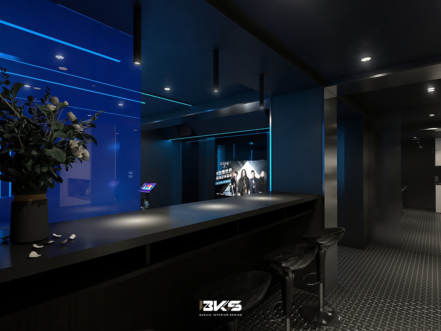
在這次的設計旅程中,我遇見了一家融合了創新與傳統的手機配件店。其小巧的空間裡,每一個細節都蘊含著精緻的藝術。
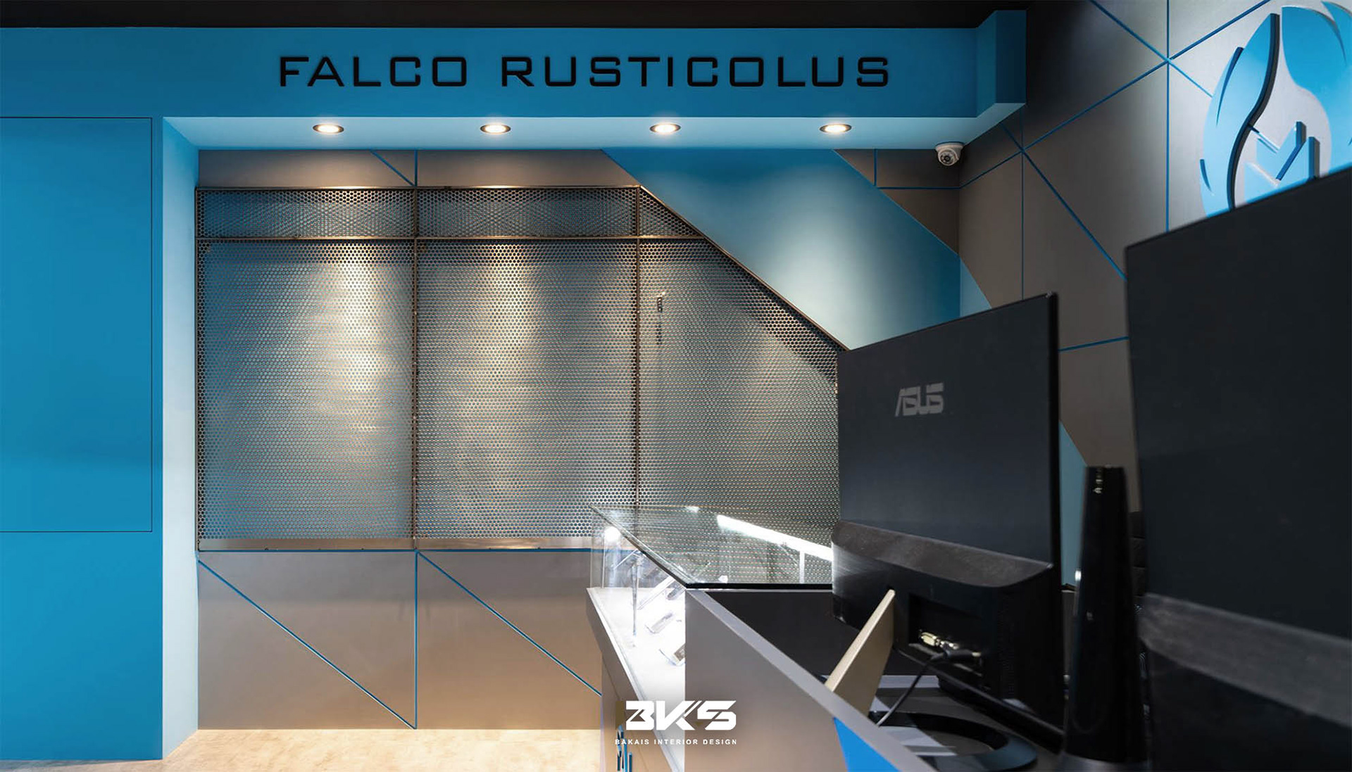
運用大膽的視覺切割線,我試圖挑戰傳統空間的邊界,並創造出現代簡約而又具有深度的設計感。這不僅僅是對於現代資訊時代的致敬,更是試圖以設計帶領顧客體驗整個空間的敘事。
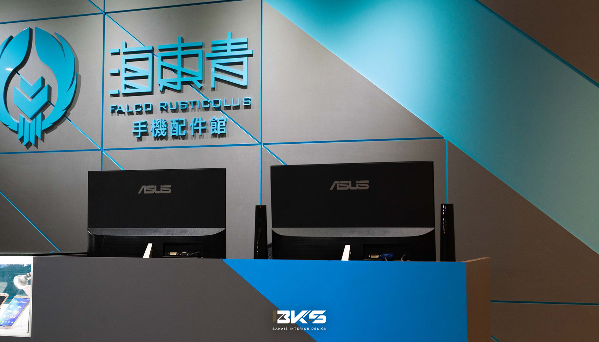
牆面的金屬毛絲面與鮮明的科技藍相結合,成為店內的主打視覺。這樣的組合,雖看似簡單,但背後的工法卻是一場挑戰。每一寸的毛絲、每一滴的藍都需精心選擇與搭配,為的是要創造出最完美的視覺饗宴。
最後,為了將整體設計串聯起來,我特地為店家設計了一組品牌LOGO及整體的配色。這不僅是一個標誌,更是一種承諾,向每一位走進這家店的顧客展示,這裡,不僅是一間手機配件店,更是一間融合了藝術與科技的現代館。
In this design journey, I encountered a mobile phone accessory store that seamlessly blended innovation with tradition. Within its compact space, every detail exudes refined artistry.
Utilizing bold visual lines, I aimed to challenge the boundaries of traditional spaces and create a modern design that is both minimalistic and profound. This isn't just an homage to the modern digital age but an attempt to use design to lead customers through the narrative of the space.
The combination of the wall's metallic brushed finish and the striking tech blue becomes the main visual focus within the store. Although this combination seems simple, the underlying craftsmanship is indeed a challenge. Every inch of brushing, every drop of blue needs meticulous selection and coordination, all to create the most impeccable visual feast.
Lastly, to tie the overall design together, I specifically crafted a brand logo and a unified color scheme for the store. This isn't just a logo, but a promise, showing every customer that steps into the store that this is not just a mobile accessory store, but a modern gallery where art meets technology.
BKS貝凱斯室內藝術設計工作室 / LINE ID : @bks.design
Copyright @ 2023 bks interior design.
FB : BKS.lnterior Design / IG : bks.interior.design
FB : BKS.lnterior Design / IG : bks.interior.design
更多360全景作品


